Box sizing
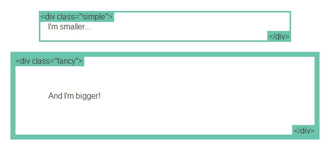
Sur l’excellent tuto css learnlayout.com, on découvre la propriété css box-sizing. Le site donne l’exemple suivant : deux div contenant du texte.
.simple { width: 500px; margin: 20px auto; }
.fancy { width: 500px; margin: 20px auto; padding: 50px; border-width: 10px; }
On voit qu’en rajoutant du padding et une bordure, toutes ces marges s’ajoutent les unes aux autres, décalant d’autant notre div.
La solution préconisée sur ce site est d’utiliser la propriété box-sizing, qui va assurer l’homogénéité de nos blocs.
.simple {
width: 500px; margin: 20px auto;
-webkit-box-sizing: border-box;
-moz-box-sizing: border-box;
box-sizing: border-box;
}
.fancy {
width: 500px; margin: 20px auto;
padding: 50px;
border: solid blue 10px;
-webkit-box-sizing: border-box;
-moz-box-sizing: border-box;
box-sizing: border-box;
}
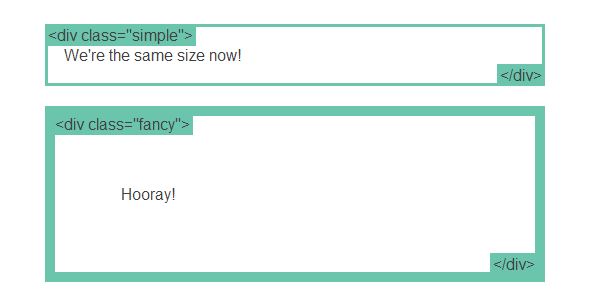
On peut même s’amuser à appliquer le css à tout les éléments du site :
* {
-webkit-box-sizing: border-box;
-moz-box-sizing: border-box;
box-sizing: border-box; }
Mis à jour le
Par Copier coller | Dans CSS